
May28
In this article, we will focus on creating comparison charts using Excel, but also explore alternative tools that create such charts effortlessly.
Read More ⟶
May17
Infographics simplify complex information into engaging visual stories using text, data, and graphics. To create effective infographics, it's important to plan ahead, understand your audience, and choose a relevant topic. Key elements include a clear headline, logical flow, accurate data, and compelling visuals. Design should prioritize simplicity, readability, and visual hierarchy. Use high-quality images and optimize for sharing across platforms. Data visualization plays a crucial role in enhancing understanding. Great infographic examples, like those from Nike or National Geographic, combine creativity with clarity. Ultimately, successful infographics inform, inspire, and drive audience engagement through purposeful storytelling.
Read More ⟶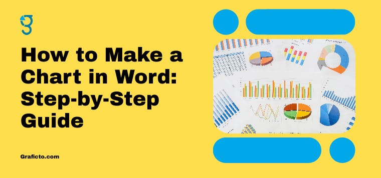
May14
Creating charts in Microsoft Word helps simplify complex data and enhances the visual appeal of your documents. This guide covers how to insert various chart types—like line, bar, and pie—by using the “Insert” tab and editing data through an Excel pop-up. You’ll also learn how to customize chart styles, layouts, and elements such as labels and colors. For advanced use, Word allows linking to Excel for real-time updates and offers templates for faster formatting. Whether you're preparing a report, proposal, or presentation, mastering charts in Word boosts clarity, professionalism, and audience engagement.
Read More ⟶
Jan12
Climate change is increasing the frequency and intensity of wildfires by raising temperatures, altering precipitation patterns, and creating drier conditions. These changes, combined with human activities like deforestation, are driving more devastating fires worldwide, affecting ecosystems, human health, and economies.
Read More ⟶
Sep23
10 Ways Infographics Can Boost Your Business Presentations", uncovers how using visual content can enhance clarity, engage your audience, and help you present data more effectively. Whether you're delivering a pitch, sharing results, or communicating complex ideas, infographics simplify your message and increase impact.
Read More ⟶Jul26
Explore how the synergy of Six Sigma methodologies and infographics is reshaping business landscapes. Discover how Six Sigma's data-driven approach optimizes processes, minimizes defects, and fosters informed decision-making. Uncover the potential of infographics in converting complex data into actionable insights, facilitating clear communication across teams.
Read More ⟶
Nov19
Using infographics as a teaching strategy may be something new to some people, but it is actually an easy and effective way of teaching. In this article, we will share some tips to make your infographic more effective by using different ways to use infographics.
Read More ⟶
Feb20
PowerPoint is the most popular presentation software out there, but it’s not the only one.
Read More ⟶
Feb12
A learning management system (LMS) is an online platform for delivering training and education.
Read More ⟶