What is an infographic?
An infographic is an engaging and informative visual display of information. It condenses complex data into an understandable format that can help viewers quickly glean insights and learn new things. An infographic should not be confused with other types of graphics, such as charts or diagrams. An infographic is much more than just a pretty picture. The design principles for infographics are similar to those for other content types, but there are some critical differences in how you should do an infographic creation on your own. Below are four tips that will guide you to create better infographics.
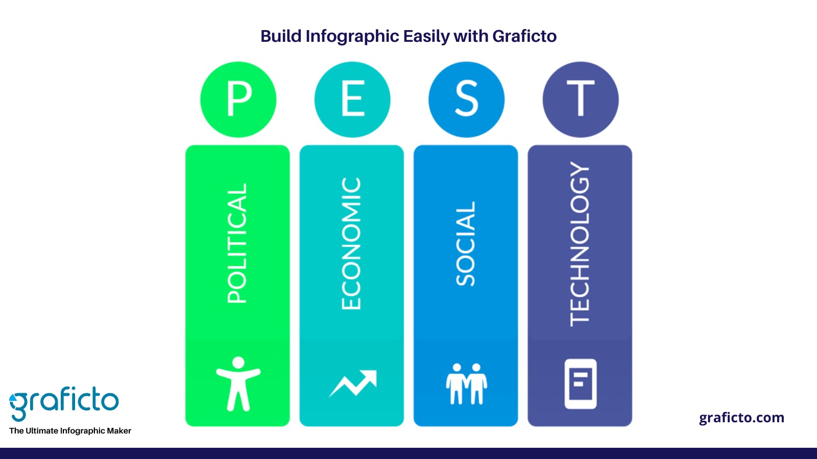
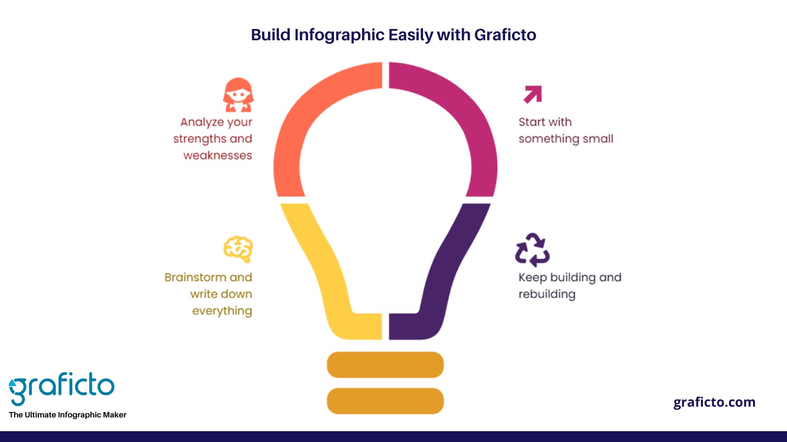
1. Create a Skeleton.
First, decide on which kind of infographic you want to create. Whether it will consist more with text or heavy on images? Will it include interactive elements? Then sketch out your idea roughly before making final decisions. In many cases, rough sketches of different concepts can make ideation easier by providing a quick reference point when trying out different layout options.
2. Choose The Best Topic
If you’re looking for ideas, start with Google Trends and or Google News. Both tools will give you an idea of what topics are trending in real time. You can also search for X's best infographics (where X is your topic) to get an idea of what others have created. Alternatively, if you have time on your hands, head over to Pinterest and see what trends people tend to pin their favorite infographics on the site. Once you’ve got a few possible topics in mind, create some templates and begin playing around. Once you find something that works, it’s pretty easy to replicate it repeatedly. Here are four tips that might help:
1) Pick your fonts before anything else;
2) Use lots of colors;
3) Go big but stay organized;
4) Make sure that there is no repetition of the same data in one creation
Keep in mind that it takes some practice to master these four rules, so be patient with yourself as you explore possibilities. What works for one infographic won't always work for another. So just ensure every element on each page fits with every other element. Once you've planned out all your pieces, don't move forward until everything's perfect. It may take longer than you think to nail down exactly what works and doesn't work, but doing it right the first time will save you a headache later down the road when people view your infographic online. Finally, remember that great infographics take time and need a generous plan ahead and enough hours to complete it from beginning to end. Choose A Template: Okay, now comes that tricky part: deciding which template is best for which purpose. Luckily, with tons of examples provided by Graficto, choosing a template has become a simple task.
3. Use The Right Tools
If you’re going to make an infographic, use tools that are easy to use and allow you to have complete control over your design. Among the many infographic designing tools available on the web, Graficto has ranked as one of the tops, earning the best reviews for its user-friendliness. In fact, it is easy for users without any experience in graphic design or coding to create high-quality infographics. There are some other tools for the same purpose, and each tool has its own advantages, so pick one that best suits your needs. Don’t overcomplicate the design in an effort to make data look more visually appealing with more colorful features such as shadows, as there is also a tendency to overcomplicate things. Instead of adding dozens of random elements, focus on simple designs that complement your message. Remember that people aren’t looking at graphs because they want to see how pretty something looks, but they want to gain insights from data.
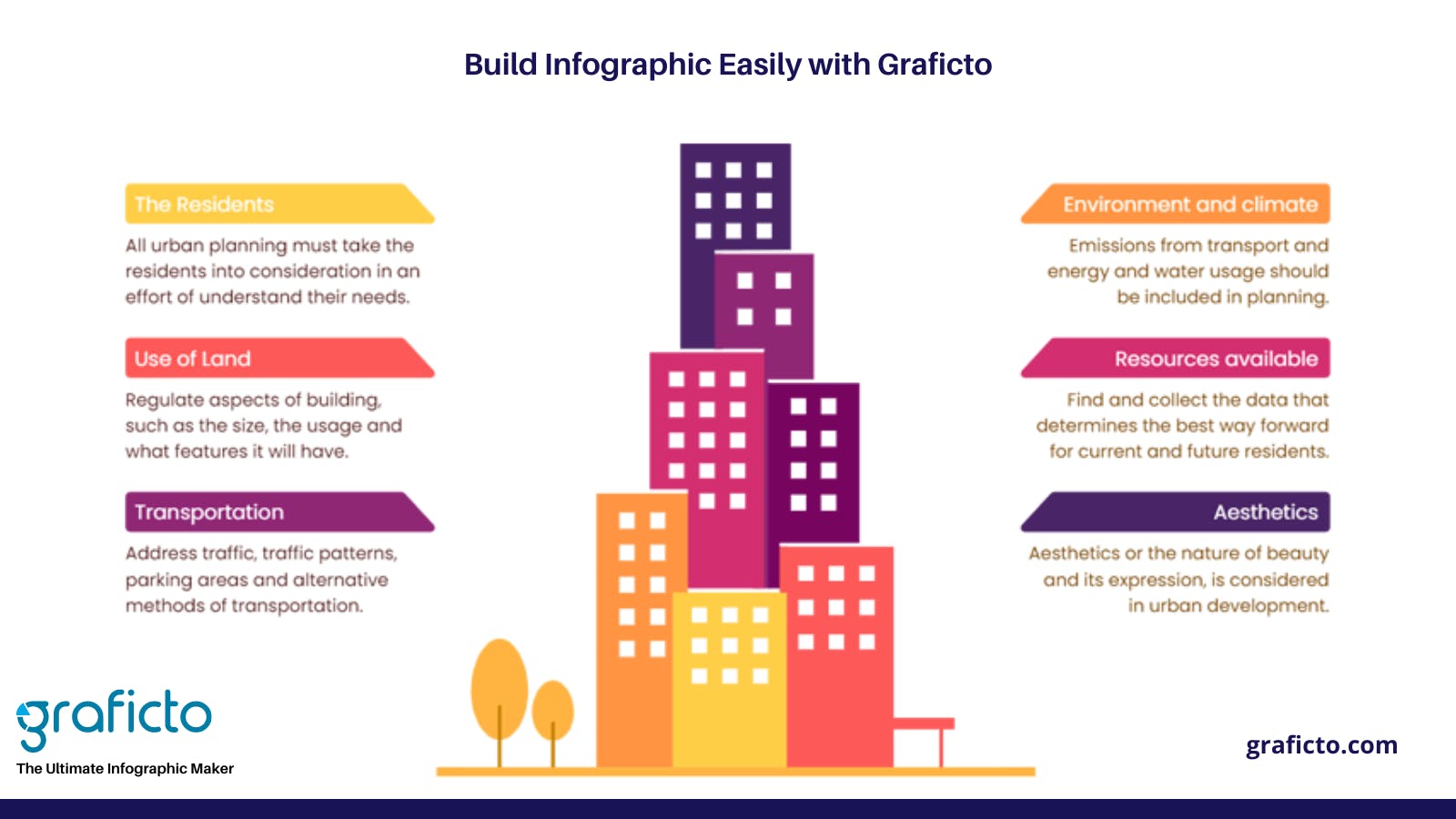
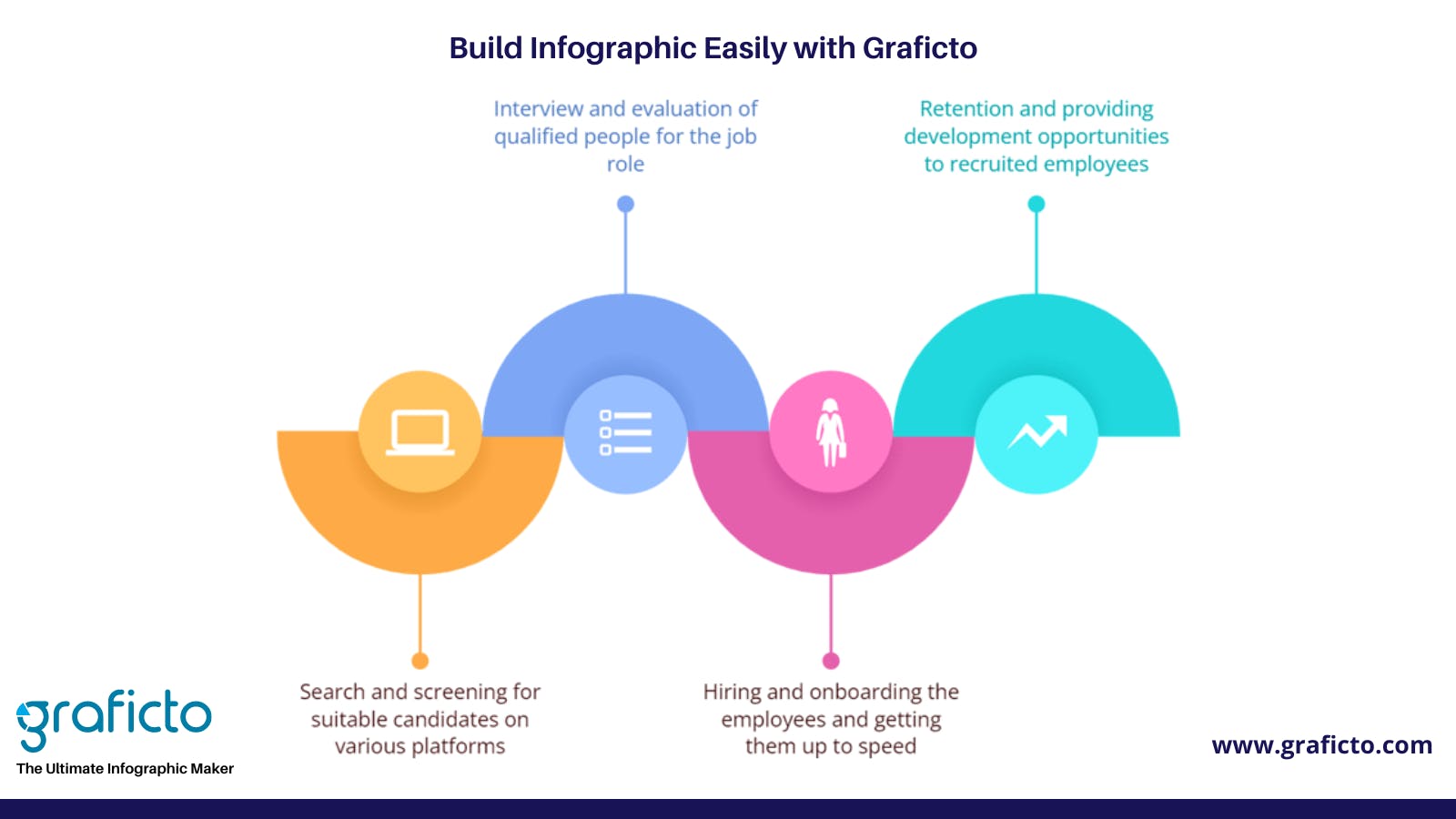
4. Design Your Creation
Designing an infographic is all about striking that sweet spot between simplicity and visual interest. First, start with a great idea and then elaborate on it. Information graphics can be used to tell stories and effectively communicate new or complicated information by distilling data into simple graphics. A significant part of effective design is choosing your subject matter wisely; if you don't have relevant material, then no amount of skill will help you create something worthwhile. When deciding what kind of information graphic you want to make, ask yourself:
- What am I trying to say?
- Can it be said in as few words as possible?
- Is there an exciting way I can present it visually?
The answers will help you to narrow down what kind of graphic makes sense for your project. Once you know what type of chart or diagram works best, give it some thought and sketch out your creation on paper. Get creative here; depending on your industry and audience, there are infinite ways to illustrate various data sets. There's also nothing wrong with doing more than one iteration if necessary. That's what rough drafts are for!
Promote and Get Seen
Social media is a great place to promote your infographic and get it seen by people who might not see it in its original post or on social news sites like Reddit, which tend to be popular places for infographics. After posting, if you want people to see it, use relevant hashtags so that Twitter users can find it with ease. The more visible your infographic is, the more likely viewers are to take action as well as notice it and remember you after they close their browser window. If you really want your infographic to stand out, consider customizing it even further. Add photos of yourself, and create a voice-over video explaining how your product works, these sorts of additions give readers value beyond just looking at pretty colors. Also, don't forget to spread the word about your piece online; link back to it from all of your online profiles and include links. If you are enjoying using Graficto as an unlimited infographic designing tool, don’t forget to suggest to your friends to copy the following link on your social media platform.
