Introduction
The infographic colors is a key part of designing an infographic. But, while you may think that it’s just a matter of choosing colors, there is much more to it than that. First, you should know that there are many different ways to represent data in an infographic. You should also know that each color has a different meaning and can be used to show differences in information. So in this article we will describe color contrast.
What is a Color Contrast?
The color contrast is the difference in light between a font or any element and its background.
What is the value of using a Color Contrast?
Color contrasts can be a very important part of the design process. The colors that you use for an infographic to be inserted in a presentation may be different from what you would use for an infographic that is going to be printed. This is because some colors such as light blue and green may fade when printed as black and white, while others such as dark red and yellow will not. By using sufficiently-contrasting colors, the visibility of content in an infographic will be stark enough to be easily read by everyone.
Why Color Contrast is important for infographic design?
There are an estimated 285 million people in the world who have visual difficulties. That means they have low vision, low contrast vision, or color vision deficiency. Your primary objective in designing an infographic is to communicate the information easily to your audience. If colors contrast is not properly incorporated, the people with visual difficulties may face a lot of problems in reading and understanding the information in your infographic. That will adversely affect your target as your message will not properly be transmitted to their minds. Hence, we should be very careful about color contrasts when we are selecting colors to design anything.
What are the standards related to Color Contrasts?
Regarding the color contrast, we can use Web Content Accessibility Guidelines. These guidelines describe specifically the foreground and background color when it comes to text. We can follow that guideline while selecting colors for our infographic designs. The Web Content Accessibility Guidelines are based on the equations of two values. Those are ,
- The score
- The ratio
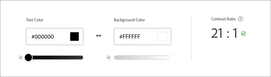
The output value of the equation lays between 0 to 21. Mostly, the value 21 indicates when we use thick black text with a white background.
Depending on that ratio value there are 5 main scores identified. They are,
- AAA
- AAA Large
- AA
- AA Large
- Fail
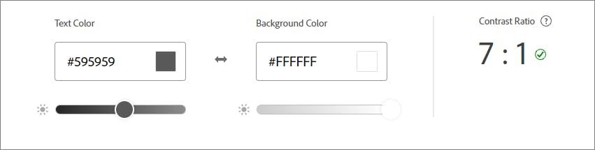
AAA
AAA means that your text has a contrast ratio of at least 7.0. Example as below,
AAA Large
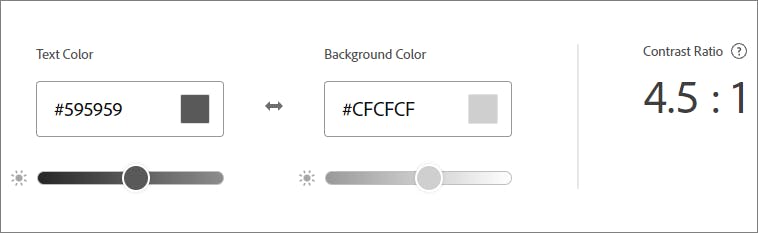
AAA Large means that your large text has a contrast ratio of 4.5 or a higher value.
And it will fail for some of the font size 17pt and below.
AA
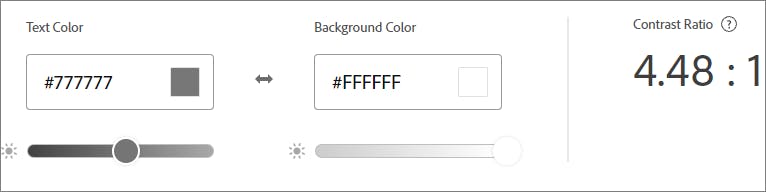
AA means that your text has a contrast ratio of at least 4.5 or higher.
AA Large (AA+)
AA Large means that your text has a contrast ratio of at least 3.0.
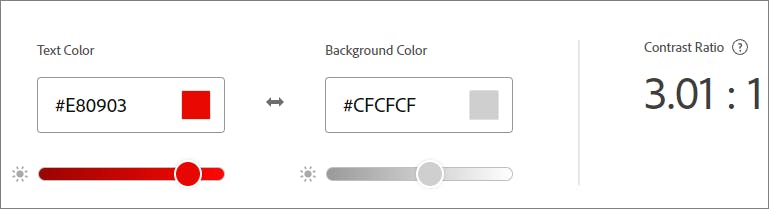
This value is the minimum level we can use for normal vision and standard text.
FAIL
Fail means that your text has a contrast ratio of 2.9 or lower. And this is not good to apply to logos, text in logos, and other decorative elements in your infographic.
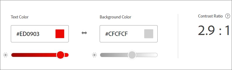
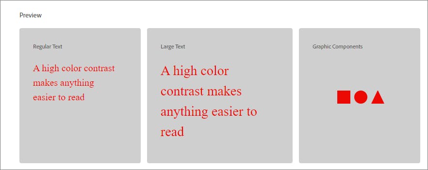
Following image showing preview of fail Contrast.
What are the tools we can use for color contrast ratio purposes?
There are so many color contrast ratio calculation tools. But following are our favorites,
- https://color.adobe.com/create/color-contrast-analyzer
- https://webaim.org/resources/contrastchecker/
- https://contrastchecker.com/
- https://colourcontrast.cc/
How to select colors for Graficto templates?
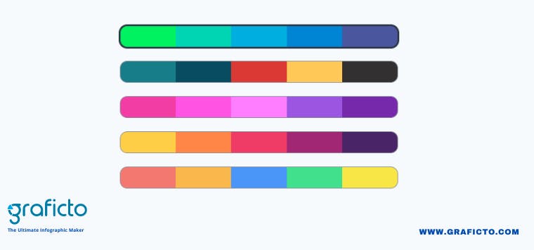
Graficto is a next generation easy infographic design tool. In Graficto we have many pre-built color palettes you can use for your infographics, and also you can create your own custom color palettes.
You don't have to worry much about color contrast when you are using Graficto's standard color palettes. Because we have defined the standard color palettes considering all these factors in AAA rating. So every infographic design you create using the the standard color palettes will look perfect. But if you are creating your own custom color palettes, make sure to think about the color contrast concept we discussed in this article. If you have a good eye, you will be able to create a good contrasting color palette straight away. But it is always a good idea to check with one of those tools we listed above.